Hospital Signs Improve Patient Experience
Directional signs make navigation easy and reduce patient stress

Great signage programs create a positive patient experience the moment a patient drives onto your campus. Entering a hospital and not knowing the outcome of your visit is scary. Understanding the fear and uncertainty facing your patients allows you to better serve them.
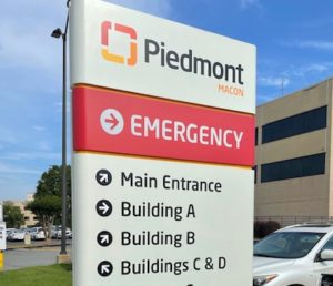
Signage could be the first impression a patient has with you. It may be the first time you are communicating with the during a critical need time. Wayfinding signage at a hospital campus should contain certain elements.
Wayfinding Sign Elements for Ease of Navigation
1 – Consistent Nomenclature for Buildings and Spaces: No one wants to have to guess if they are in the correct place nor do they want to have to walk all over a huge campus because they have gone to the wrong location.
2- Clear Copy with a Clean Background: Copy must be large enough to read by all drivers, even if they are feeling panicked and have cloudy judgement.
3 – Correct Placement: Signs must be in the correct location to allow patients enough time to take the appropriate action.
4 – Correct Amount of Communication: Too many signs and the copy becomes white noise, too few and patients do not know where to go. The correct amount of signage, in the correct location, with clear/concise copy, will ensure successful navigation of the campus. Patients will arrive at appointments without the added stress of getting themselves or a loved one to the place to get help.
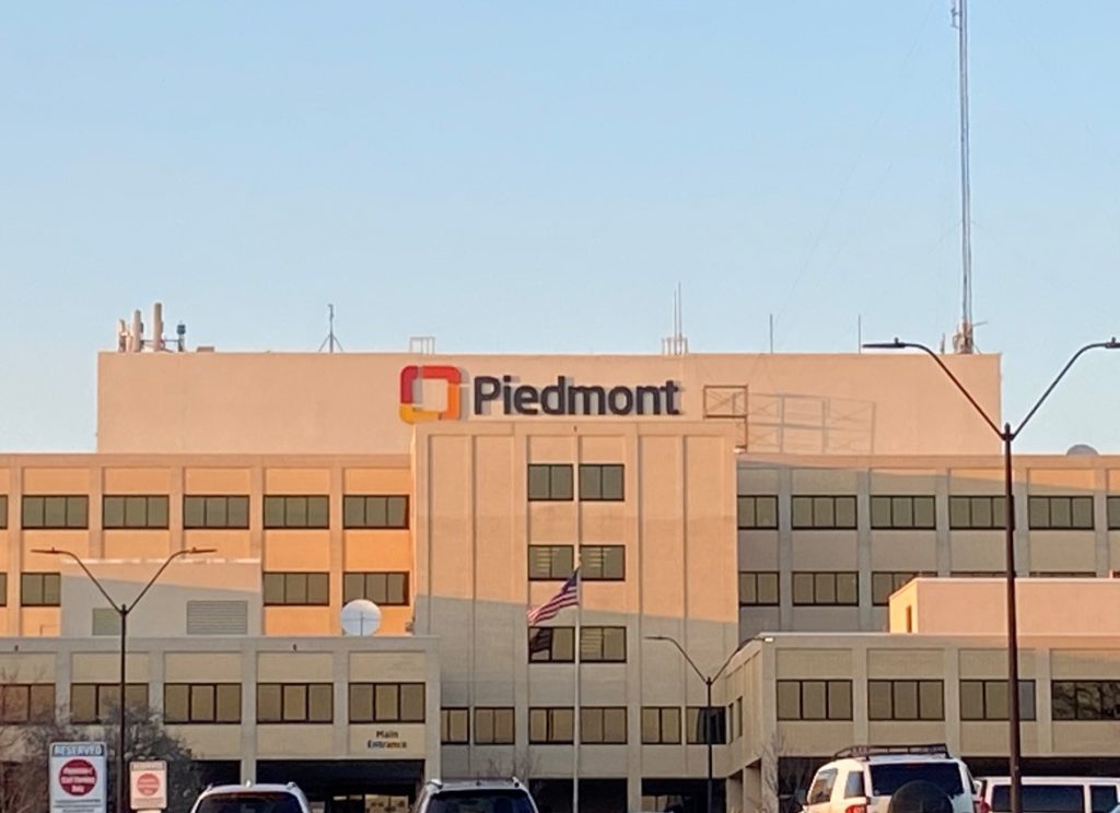
This particular project was completed this year. The rebrand was a huge win for the hospital and its patients. New signage was needed for the exterior and interior of the entire campus. FITTS worked with Piedmont from the beginning stages of the project.

Steps for Rebranding
The first step was surveying the campus to determine the scope of work. We also looked at existing campus signage. During the survey of existing sites, we found many inconsistencies in the signage program. The previous mode of operation from the medical system was to allow the local sign companies to make the signs at each hospital. This is a common approach many entities make, not realizing their brand integrity diminishes by giving individuals the opportunity to modify the design through various manufacturing methods. Consistency is a key indicator of brand integrity. We created an entirely new Family of Signs for the hospital to capture brand needs and provided much-needed consistency.
Working with Piedmont, we together built a strong, beautiful signage program that can be rolled out across all their campuses.


